AI Image Generation Checklist for Beginners
Learn how to kickstart your journey in AI image generation with essential tools, prompt writing strategies, and best practices for stunning visuals.

AI Image Generation Checklist for Beginners
AI image generation has made creating professional-quality visuals easy for anyone, even beginners. By using tools like Midjourney and platforms like Srefs.co, you can transform text prompts into stunning images in seconds. Here’s what you need to know to get started:
- What is AI Image Generation? It uses neural networks to convert text descriptions into images. Key terms include prompts (your descriptions), style references (visual examples), and resolution (image quality).
- Why Use Srefs.co? It simplifies the process with a massive style library, a Multiprompt feature for testing styles simultaneously, and tools to save and organize styles for future use.
- Getting Started: Choose tools like Srefs.co, understand U.S.-specific design standards (e.g., inches, CMYK for print), and set up an account to access features like style collections and multiprompt testing.
- Writing Prompts: Focus on four elements - image type, subject, background, and composition. Be concise and prioritize key details early in your prompt.
- Using Style References: Platforms like Srefs.co offer over 74,000 style references to refine your images. Style codes can be added to prompts for consistent results.
- Exporting Images: Tailor export settings to your project (e.g., 300 DPI for print, sRGB for digital). Use appropriate dimensions for platforms like Instagram or LinkedIn.
Pro Tip: Avoid common mistakes like overly long prompts, unclear descriptions, or relying solely on the AI output without refining. Tools like Srefs.co streamline your workflow and help you create polished, professional visuals with ease.
MIDJOURNEY AI Tutorial for Beginners - Learn AI Image Generation
Setting Up for AI Image Generation
To get started with AI image generation, you'll need to choose the right tools, ensure your setup aligns with U.S. technical standards, and create an account. Let’s break it down step by step.
Choosing the Right Tools
Srefs.co is a powerful platform offering over 74,000 Midjourney-style references. One standout feature is its Multiprompt tool, which lets you test multiple styles at the same time. The library is well-organized, featuring categories like anime, fantasy, retro, and photorealistic styles, making it easy to find exactly what you need.
You can search the library by text or upload images to locate matching styles. Once you find your favorites, save them into collections for future use. For example, you might create one collection for vintage poster designs and another for sleek, modern product photography. Additionally, the platform provides detailed insights into how prompts perform with specific styles, helping you refine your creative process.
The categorized structure ensures you won’t feel lost, and the ability to create collections streamlines your workflow, especially if you’re juggling multiple projects.
Understanding U.S.-Specific Requirements
If your projects are U.S.-focused, meeting specific standards is key to delivering professional results. For print, use inches for dimensions and CMYK color mode. Digital projects should stick to the sRGB color space for accurate display.
Here’s a quick guide to common U.S. print sizes:
- 8.5" × 11": Standard documents
- 18" × 24": Posters
- 5" × 7": Greeting cards
For digital platforms like Etsy, these measurements ensure your designs align with customer expectations. Additionally, use the MM/DD/YYYY format for dates and follow U.S. currency conventions, placing the dollar sign ($) before the amount (e.g., $1,299.99).
Resolution also matters. Web images typically require 72 DPI, while print materials need 300 DPI for sharp results. For large-format prints, 150 DPI often strikes a good balance between quality and file size.
Creating an Account on Srefs.co
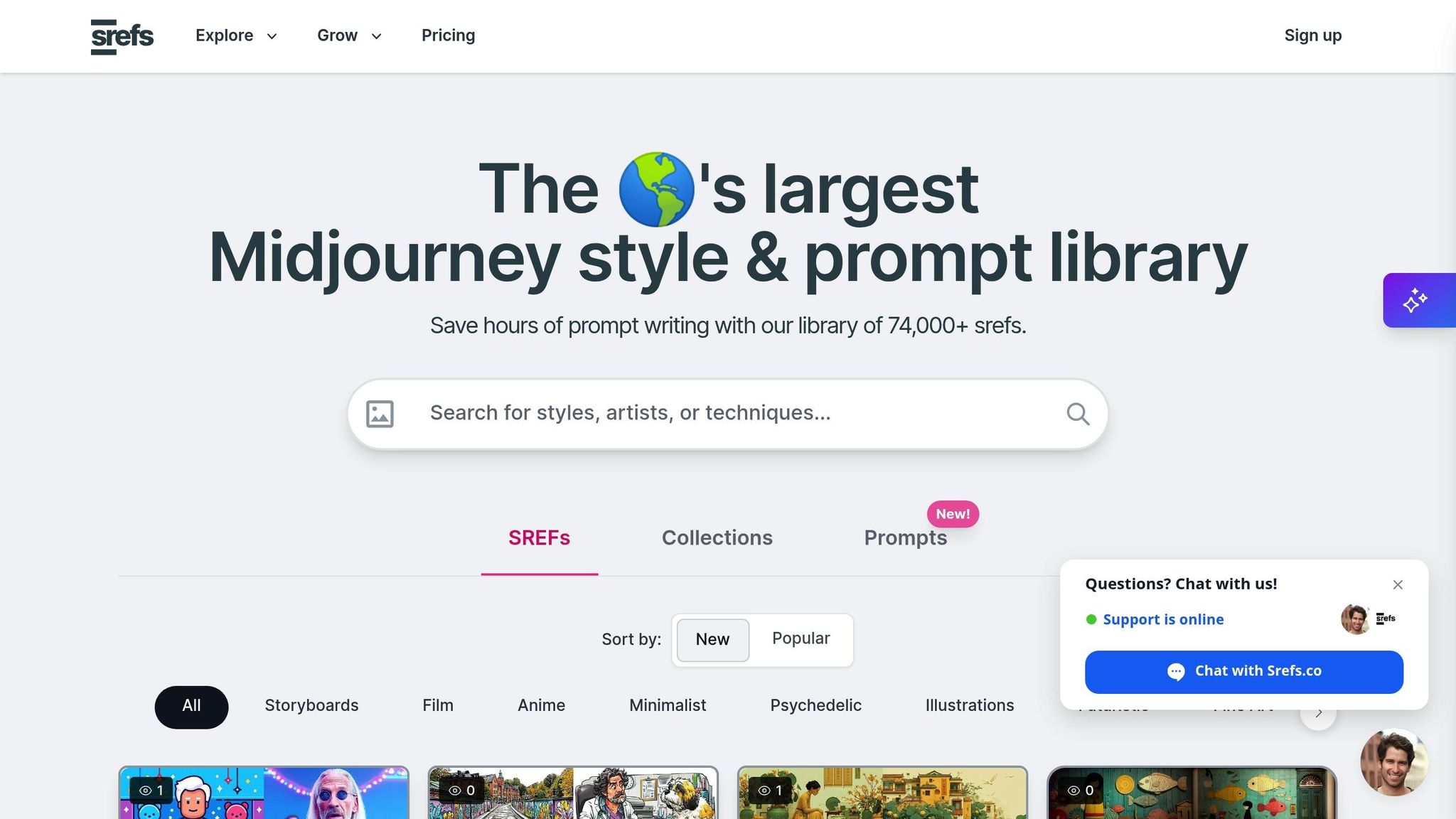
To unlock all the features Srefs.co offers, you’ll need to create an account. Signing up is straightforward - just use your email and password. The platform offers several pricing options:
- Hobby Plan: $6/month (billed annually). Includes unlimited browsing, style reference copies, collections, Discord community access, and basic support.
- Pro Plan: $8/month (billed annually). Adds the Multiprompt feature, custom style reference imports, VIP support, and early access to updates.
- Lifetime Access: A one-time payment of $129. This gives you permanent access to everything, including unlimited collections, full Multiprompt functionality, VIP support, and early access to new features.
For those seeking inspiration, the Discord community is a great place to connect with other users, share ideas, and learn from their experiences. Advanced users can also benefit from API access, which allows integration of Srefs.co’s tools into custom workflows or applications.
Writing Prompts and Using Style References
Learn how to craft effective prompts and use style references to turn random AI outputs into polished, professional visuals.
Building a Strong Prompt
A well-constructed prompt focuses on four key elements: image type, main subject, background, and composition. AI systems tend to give more weight to the words at the beginning of your prompt.
Start with the image type and main subject, as these are the most critical. For example, instead of saying, "A coffee shop with warm lighting that looks vintage in a digital art style with people sitting inside", lead with "Digital art of a vintage coffee shop, warm interior, customers reading, wide shot." This approach ensures the most important details are prioritized.
Next, include background details and composition style. Specify technical aspects like "portrait orientation" or "wide shot" to refine the output. Adding style cues such as "photorealistic", "cinematic", or "cartoon" helps shape the overall vibe. Color tones can also make a big difference - use "warm tones" for cozy scenes or "cool blues and grays" for modern, tech-inspired visuals.
For projects targeting U.S. audiences, consider including cultural context. For example, phrases like "American farmhouse style" or "Fourth of July celebration" can help tailor the output to resonate with American consumers. Similarly, if you're designing branding materials, specify the mood with terms like "professional corporate aesthetic" or "friendly small-business vibe."
Once your prompt is solid, you can take it to the next level by incorporating style references.
Using Style References
Style references (srefs) are a game-changer for achieving consistent, high-quality visuals. They capture the essence of an aesthetic - such as colors, textures, lighting, and mood - from existing images and apply it to your new creations without directly copying any specific elements. This feature is especially useful with tools like Midjourney versions 6 and 7, making it easier to maintain a cohesive look across multiple projects.
Platforms like Srefs.co offer a library of over 74,000 style references, organized into categories for easy browsing. Whether you're creating prints for Etsy or branding materials for a client, finding the right style reference can save time and ensure consistency.
To use style references effectively, start by identifying the aesthetic that matches your project. For example, if you're designing a series of digital prints, choose a style that aligns with your brand and save it for future use. For client work, style references help maintain a unified look across deliverables, whether you're working on website headers, social media graphics, or marketing materials.
Using Srefs.co is straightforward: browse the library, copy the style code, and include it in your prompt with the --sref parameter. For instance, "Corporate headshot of a marketing professional, modern office background --sref 1234567890" applies the selected style reference to your image. The style code handles the visual details like lighting and color grading, while your prompt defines the content.
Pro tip: Organize your style references into themed collections. For example, create separate folders for "E-commerce Product Photography", "Social Media Graphics", and "Print Marketing Materials." This system not only saves time but also ensures a consistent aesthetic across similar projects.
Using Multiprompt for Style Testing
Once you've nailed down your prompt and style references, you can experiment with different styles using Srefs.co's Multiprompt feature. This tool allows you to test multiple aesthetics at once, making it easy to compare options side-by-side.
This is especially helpful when you're unsure which style works best. For instance, if you're designing a logo for a client who wants something "modern but approachable", you can test three different styles - one minimalist, one with organic textures, and one featuring subtle gradients. Seeing all options together helps you quickly identify the best fit.
You can also combine multiple style references in a single prompt. By including several SREF codes separated by spaces, you can blend different aesthetics. For example, mixing a vintage photography style with modern color grading might create the perfect look for a retro-modern brand. Adjusting the weight of each style lets you control how much influence each has on the final result, giving you even more creative flexibility.
Multiprompt results are displayed side-by-side, making evaluation easy. Consider how well each style fits your brand requirements and how it will perform across different formats. For example, a style that looks great on social media might not translate as well to print materials, so it's important to test for all use cases.
For U.S.-based businesses, this approach is particularly useful in a competitive market. Whether you're aiming for a sleek, minimal look for tech products or a warm, inviting aesthetic for hospitality brands, Multiprompt helps you pinpoint the right style quickly. The time saved on revisions makes the $8 monthly cost of the Pro plan a worthwhile investment, especially when client satisfaction hinges on getting the visuals just right.
sbb-itb-c7ab506
Customizing and Exporting Images
Turning AI-generated visuals into polished, client-ready images requires fine-tuning and understanding how to prepare files for specific purposes. By learning how to adjust parameters and export settings, you can elevate your images from decent to professional.
Refining Generated Images
To start refining your images, focus on the basics like aspect ratio adjustments. For example, if you're creating an Instagram post, use --ar 4:5, or for a LinkedIn header, go with --ar 3:1. These small tweaks ensure your visuals fit the platform's requirements perfectly.
Next, consider resolution improvements. Adding --q 2 to your prompt boosts rendering quality, which is especially useful for print projects where images may need to scale up to larger dimensions, such as 8×10 inches or more.
If your image is close to what you want but still needs a few tweaks, refine your prompt. For instance, if a corporate headshot has the right composition but lacks the desired lighting, you could add terms like "soft natural lighting" or "golden hour illumination." Often, minor adjustments work better than starting from scratch.
Another useful tool is style reference weight adjustment. By using --sref [code] --sw 50, you can reduce the influence of a style, or amplify it with --sw 150. This is particularly handy when you want to tone down or emphasize a style for professional settings.
Color correction can also be achieved directly through prompting. Phrases like "color graded", "muted earth tones", or "vibrant but professional" help you fine-tune the mood of your image. For U.S.-specific business needs, you might try prompts like "corporate color palette" or "American flag inspired colors" to align with local expectations.
To avoid common issues, make use of negative prompting. Adding --no blurry, distorted, low quality can help eliminate unwanted artifacts. For professional images, you might also include terms like --no unprofessional, casual, messy to maintain a polished look.
Once your image meets your standards, it's time to prepare it for export.
Exporting Images for U.S. Use Cases
When exporting, it's important to tailor your settings to the intended use, whether for print or digital platforms. This ensures your images look sharp and professional, no matter where they appear.
For U.S. print dimensions, use the following guidelines:
- 8×10 inch prints: 2,400×3,000 pixels at 300 DPI
- Business cards (3.5×2 inches): 1,050×600 pixels
- Posters (18×24 inches): 5,400×7,200 pixels
For digital applications, remember that social media platforms often compress images. To counteract this, start with higher-quality files. For example:
- Instagram: 1,080×1,080 pixels for square posts or 1,080×1,350 pixels for portrait orientation
- Facebook cover photos: 820×312 pixels
- LinkedIn company pages: 1,192×220 pixels
When choosing a file format, go with PNG for graphics that include text or transparent backgrounds and JPEG for photographs, as it strikes a balance between quality and file size.
Color profiles are another critical factor. Export digital images in sRGB color space for consistent display across different screens. For print projects, convert files to CMYK using professional tools like Adobe Photoshop or request the conversion from your printer.
For commercial printing, include bleed areas to account for trimming. For instance, if you're designing a 5×7 inch postcard, extend the image to 5.25×7.25 inches to ensure no important details are cut off. Most U.S. print shops follow a standard bleed margin of 0.125 inches.
If you're working on multiple images, batch processing can save time. For example, if you're preparing a series of product images for Etsy, set your export settings once - such as 2,000×2,000 pixels at 72 DPI in sRGB JPEG format - and apply these to all your images. This ensures consistency and speeds up your workflow.
Finally, for client deliverables, organize your exports into clearly labeled folders, such as "Web_Use_72DPI" and "Print_Use_300DPI." Including a simple text file that explains the purpose of each folder can help clients avoid using the wrong file type, preventing quality issues or costly reprints. This extra step makes your work more professional and user-friendly.
Avoiding Common Mistakes
When starting out, it's easy to make errors that can hurt the quality of your AI-generated images. By building on the prompt strategies discussed earlier, you can sidestep these common pitfalls and produce more consistent, polished results.
Common Beginner Mistakes
One frequent mistake is relying on conversational phrasing instead of listing key elements directly. For example, instead of writing, "I want a sunset over mountains with dramatic clouds during golden hour", simply state: "sunset over mountains, golden hour, dramatic clouds." Remember, AI models have token limits and prioritize early details in a prompt. Overly long prompts can dilute your key ideas, so always lead with the most important details. If you're aiming for "corporate headshot of a woman in a navy blazer", make sure that description comes first.
Another issue is unclear or contradictory prompts. Mixing too many alternatives or conflicting details often results in images that miss the mark. Be precise and focus on one clear concept to improve consistency.
Syntax errors are also common, especially when using commands that aren't supported by your chosen platform. For instance, Midjourney's "--no" syntax won't work in models that don't support it. If you're using negative prompts, make sure to input those instructions in the correct field rather than mixing them into the main prompt.
Relying solely on the prompt can also limit your results. If an image has the right expression but the wrong hair color, tools like inpainting can fix specific areas without needing to rewrite the entire prompt. Similarly, using style references and adjusting settings can help refine your output.
Keep in mind that different AI models respond to different prompting styles. Models trained on tag-based systems, like SD 1.5, often work best with concise keywords such as "portrait, professional lighting, business attire." On the other hand, models like DALL-E may perform better with natural, descriptive prompts like "professional headshot with soft natural lighting and business clothing." Understanding these nuances will help you tailor your approach for better results.
Checklist for Consistency
To ensure each image meets your standards, use this checklist to guide your process:
- Align dimensions and aspect ratio: Make sure your prompt includes the right specifications for your project needs.
- Review your prompt structure: Read it aloud to confirm it flows logically, prioritizes key details, and avoids contradictions.
- Check technical settings: Ensure any special syntax or commands are compatible with your platform, and verify that your settings match your project requirements.
- Avoid copyrighted elements: For commercial projects, steer clear of terms like "Disney-style animation." Instead, describe it as "colorful cartoon style with rounded characters" to stay original and legally safe.
- Generate multiple iterations: This is especially important for maintaining style consistency in a series, such as for client work.
- Keep a prompt library: Document successful prompts to create a go-to resource for future projects, saving time and effort.
Conclusion
Ready to dive into AI image generation? Here's a quick checklist to get you started: set up the right tools, write clear and precise prompts, include style references, and steer clear of common pitfalls to produce polished, professional-looking images.
Taking time to review your process can make all the difference. Consistency comes from having a structured approach. Start by leading with the most critical details in your prompts, avoid conflicting descriptions, and don’t hesitate to generate multiple versions to find the one that works best. Keep in mind that different AI models may respond differently to your prompts, so it’s worth adapting your style to fit the tool you’re using.
Srefs.co makes image creation a breeze for beginners. Instead of struggling to describe a specific look or vibe, you can explore their extensive library of styles and apply them instantly. Plus, their multiprompt testing feature lets you compare results side by side, helping you quickly pick the best option. This efficient workflow makes it simple to organize, refine, and reuse your favorite prompts.
FAQs
How can I make sure my AI-generated images meet U.S. standards for print and digital use?
To align with U.S. standards for print and digital use, it’s crucial that your AI-generated images comply with copyright laws. In the United States, copyright protection generally requires a degree of human authorship. This means if you’re planning to use AI-generated images commercially, they should include enough human input or editing to meet these requirements.
For digital applications, save your images in commonly used formats like JPEG or PNG and ensure they use the sRGB color space, which is the standard for web and digital displays. When preparing images for print, make sure they are at least 300 DPI to guarantee high-quality results. Adhering to these standards will help you meet both the legal and technical expectations for image use in the U.S.
How can I write effective prompts for AI image generation?
To craft prompts that yield the best results in AI image generation, aim for clarity, specificity, and detail. Begin with the main subject or concept, then layer in key details such as the artistic style, color scheme, and perspective. Structuring your prompt with concise, comma-separated phrases can make it easier for the AI to interpret.
Adding context - like the mood or purpose of the image - can further guide the AI toward producing results that align with your vision. You can also fine-tune the outcome by specifying elements such as lighting, composition, or textures. Including negative prompts (details you want to exclude) is another way to sharpen the focus and improve precision.
Steer clear of vague or overly general prompts, as they often lead to inconsistent or unsatisfactory results. The more descriptive and intentional your prompt, the closer the AI will come to creating the image you have in mind.
How do I ensure consistency across multiple AI-generated images using style references?
To ensure your AI-generated images maintain a consistent look, it's essential to include detailed style descriptions in your prompts. Clearly outline the artistic elements you're aiming for - think about the color palette, lighting, and textures. If possible, include a reference image to help the AI mimic specific visual qualities more effectively.
Some tools offer features that let you apply the style of one image to others, making it easier to create a unified visual theme. You can also reuse a base image as a guide and tweak settings like style intensity or character details for even better results. Sticking to a defined theme or consistent parameters throughout the process will make achieving uniformity much simpler.

Alex Chen
AI art enthusiast and digital creative with over 5 years of experience in generative art. Passionate about exploring the intersection of technology and creativity.
4 articles


